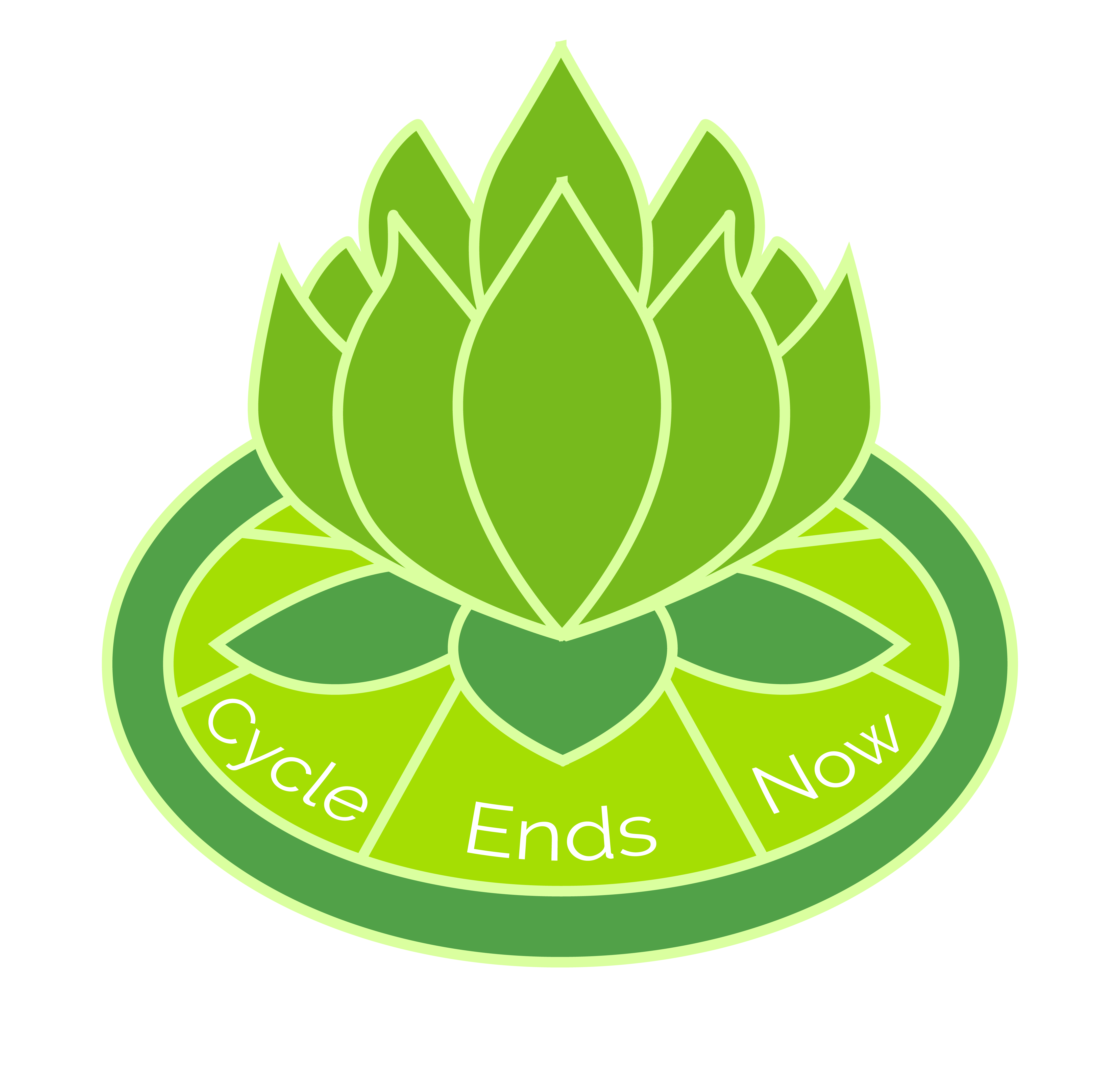
Cycle Ends Now Logo
The Overview
One of my professors had a student in another class who was looking for someone to design a logo for their non-profit organization. Intrigued, I convinced a classmate to collaborate with me and take up the offer. We got in contact with the student and started figuring out what logo would work best for their organization.
The Context and Challenge
We had to design a logo for a non-profit that seeked to help woman and children affected by domestic abuse. They wanted a round logo, something like an onion that had many layers, but also including something that would represent that ending of a cycle, like flower petals. They attached a colour scheme of different greens that would represent rebirth, or a fresh start. Otherwise, they gave us free reign to change things as we needed.
The colour scheme was definitely a big help, but creating an onion logo seemed like a bold task and one we couldn't quite figure out how to execute in an aesthetically pleasing manner. We also had a deadline that was fast approaching, no real idea of how to divy up the work and only a vague idea of where to start. We had our work cut out for us.
The Process and Insight
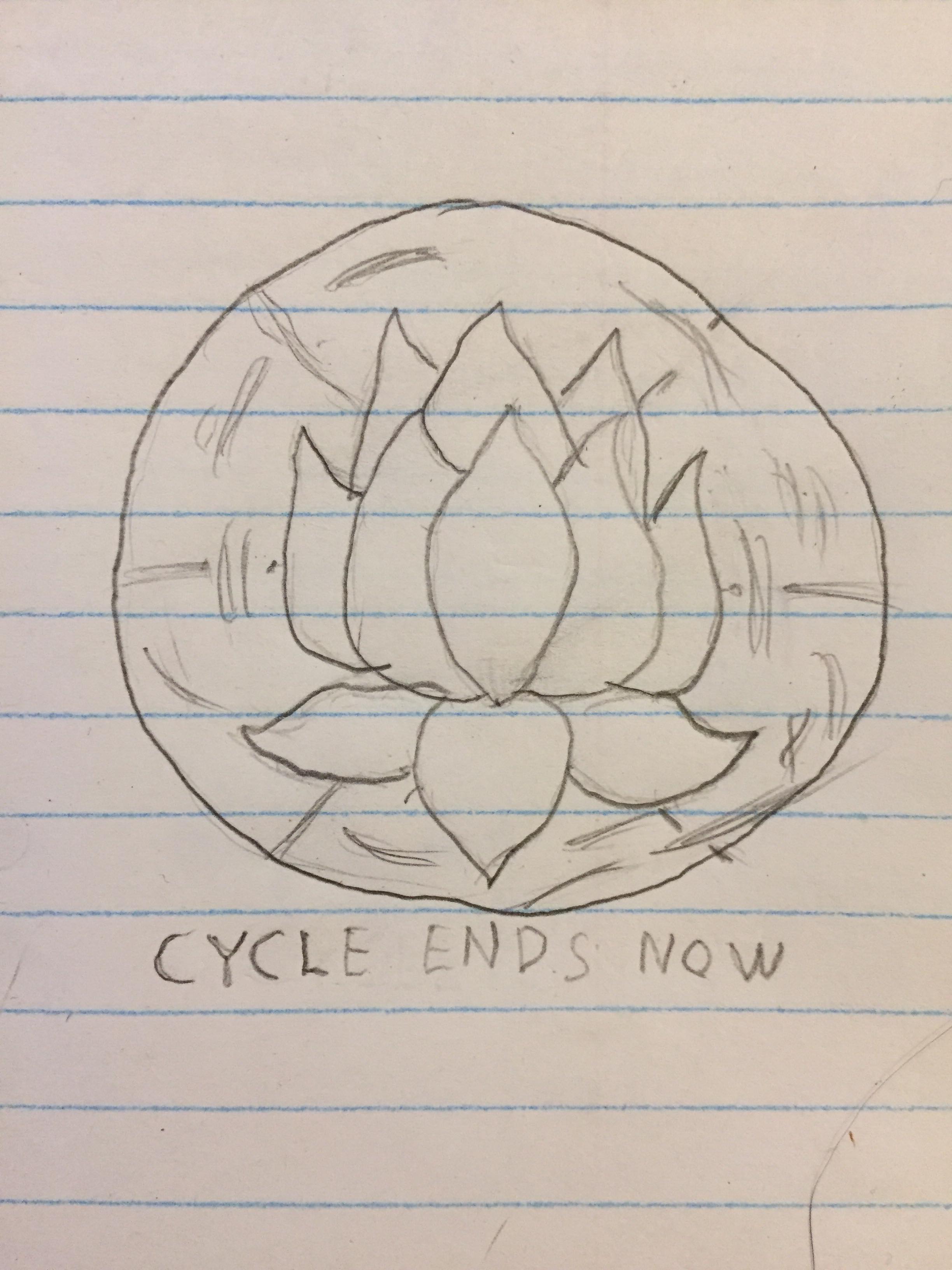
During the long weekend, we took some time to think about this onion idea and how to make it appealing. My partner, Dannielle, did some rough sketches but nothing was looking great. Then she had a revelation: abandon the onion. The client had mentioned flower petals representing a cycle ending, so Dannielle did a little research and came up with our new symbol: the lotus flower.
She pitched the symbolism to me, and there were some obvious similarities. First the lotus flower petals are layered and can peel back much like an onion. The flower represents rebirth as well, which already gave it one up on the onion. Finally, the green lotus in particular is a good gift for anyone trying to improve their life and start good habits. It was a no-brainer.
So, we drew out three design sketches (mine has the especially rough pencil work), and sent them to the client. We played around with different places to write the organization name, as well as ripple effects and replicating a wheel that was part of their website design, but combining it in the place of a lily pad in the design.
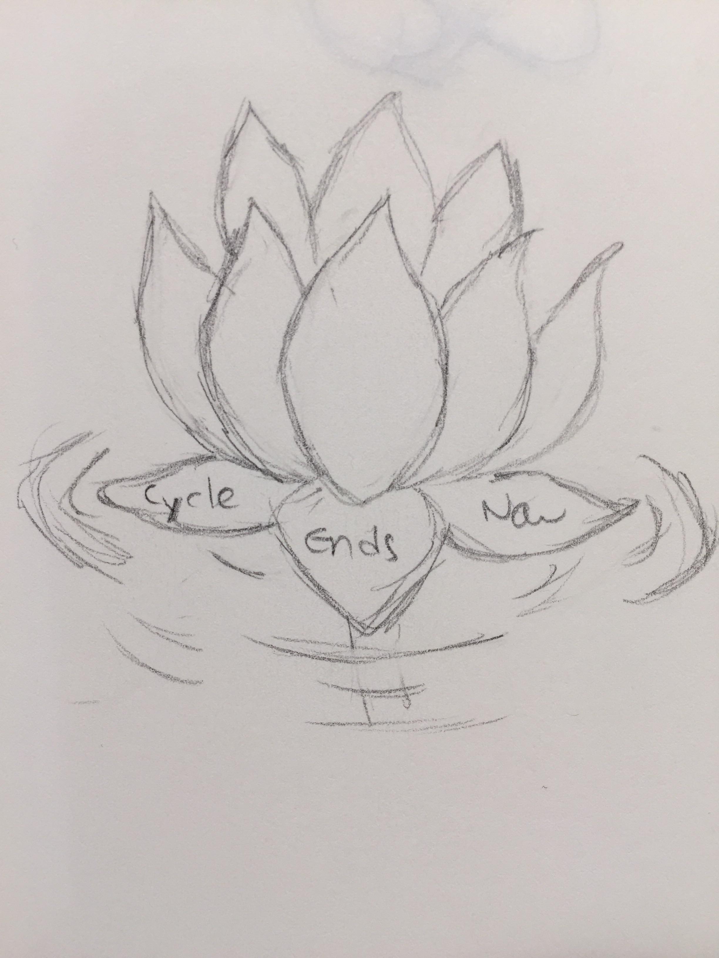
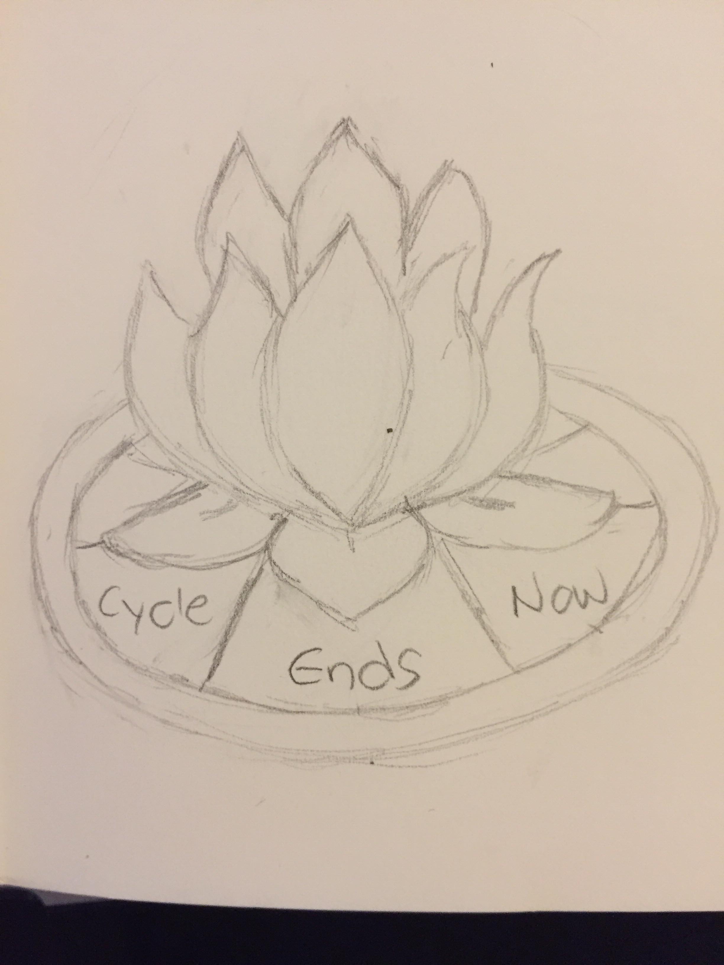
The Solution
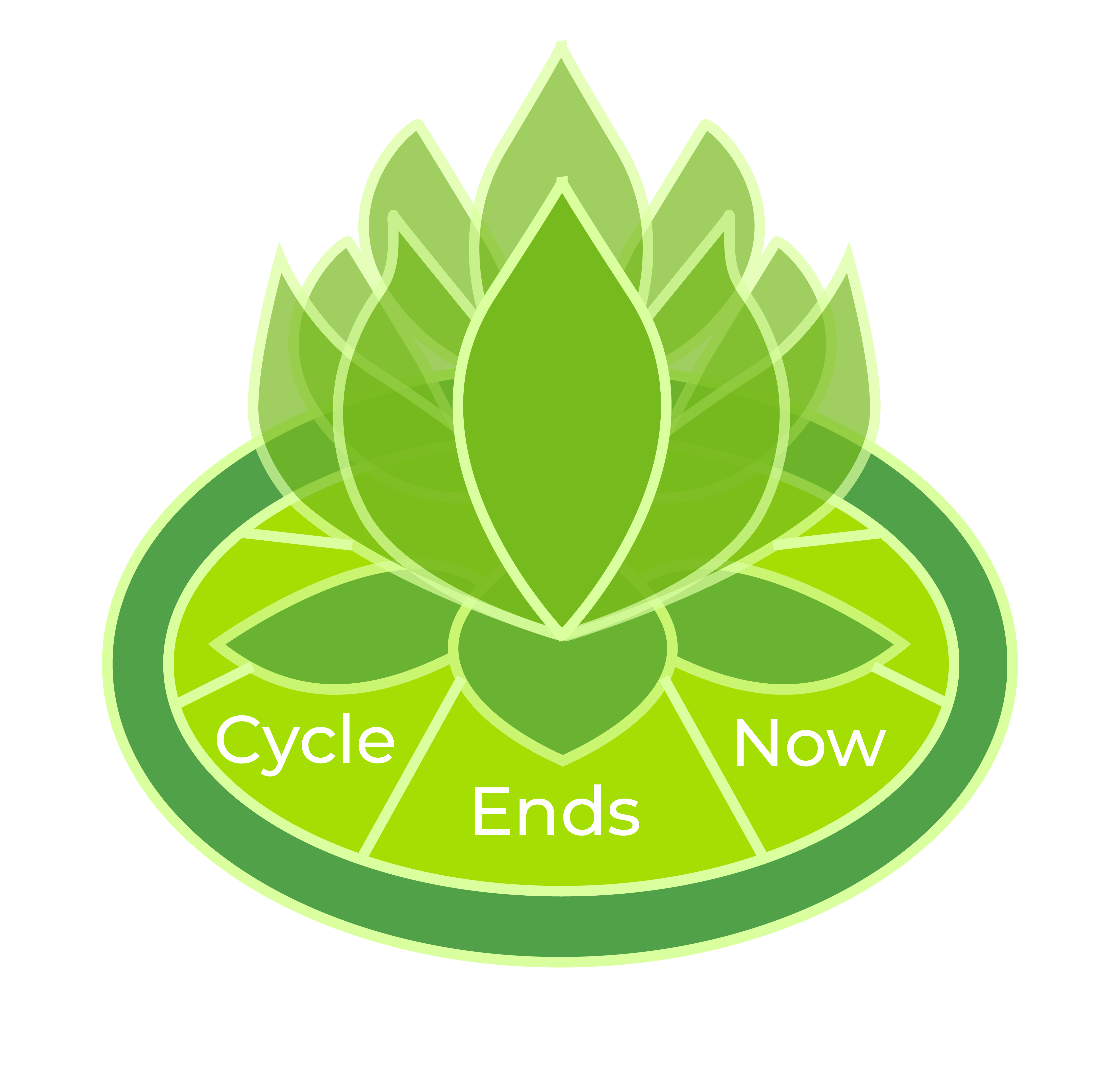
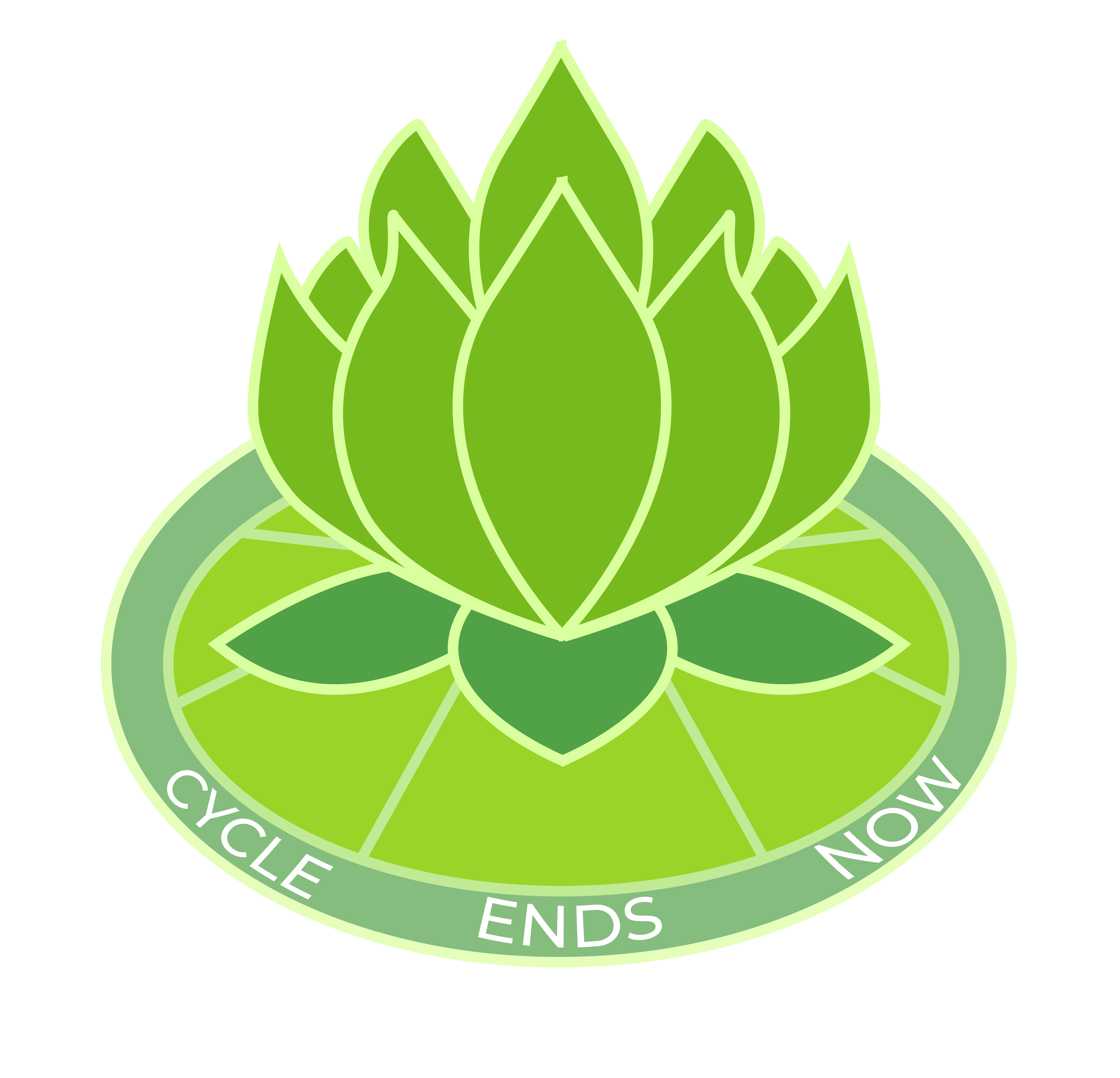
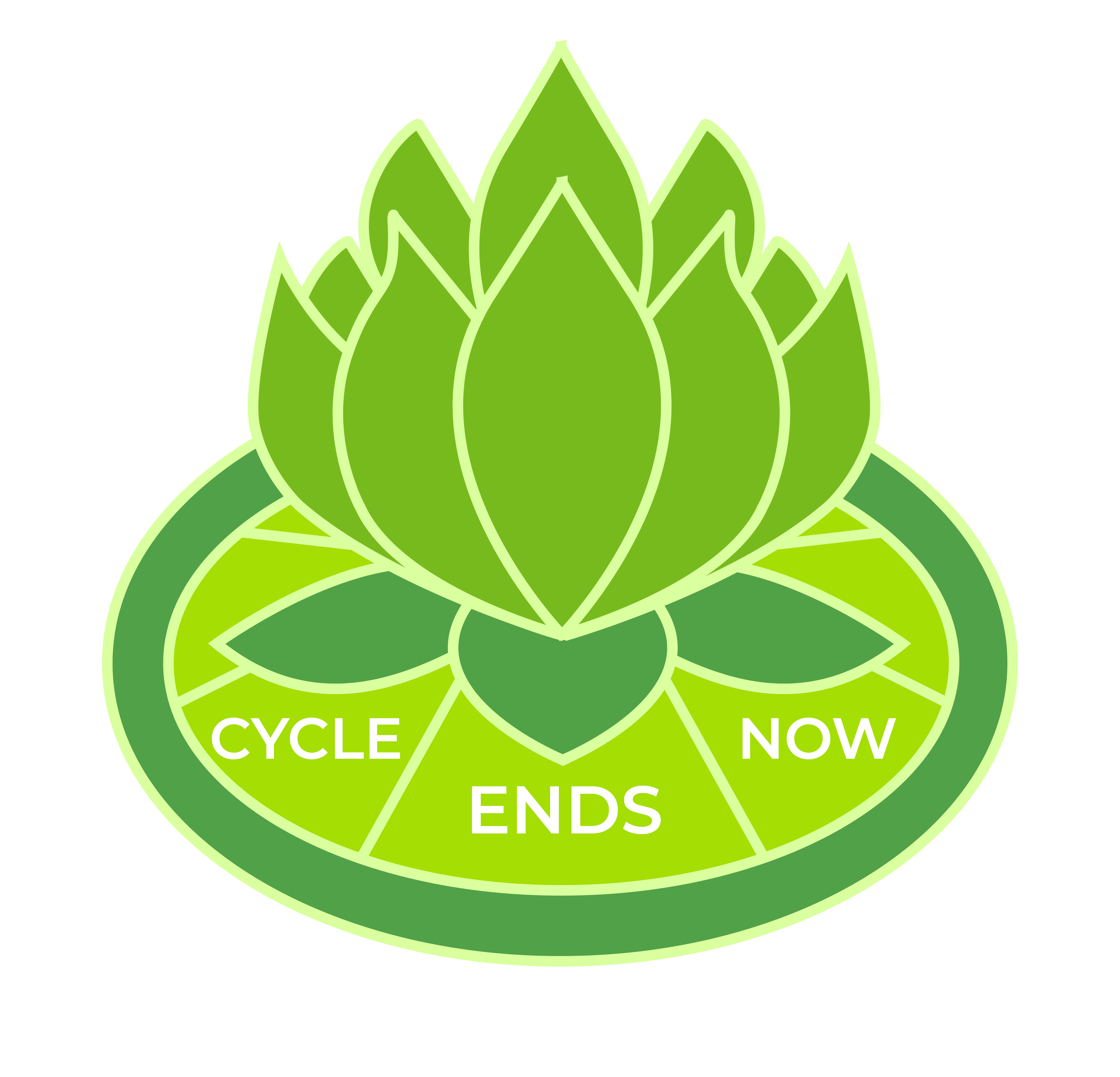
After sending the sketches to the client, they voted on the middle sketch. So, we sat down in between classes, popped open Illustrator and I started working on it. I used the sketch for reference, consulted with Dannielle on what colours we should use where and we tried to decide how to fit the text onto the logo. It went pretty smoothly.
We did a couple variations, messing around with opacity, text location, and font size. We ended up going with the design at the top of the page, but here were a couple variations that we entertained for a hot minute.
The Results
In the end, it was an incredibly fulfilling project. I think the three most important aspects of a project, to me, are who the client is, what the project is, and the reaction to the project. I was impressed and inspired by the client, which may have been the most fulfilling part of the project. Logo designs are always fun and challenging, and they seemed really happy and satisfied with the final design, so it was a win in my books!
Looking back on the project now, I have few regrets. In hindsight I realized that we never intergrated the ripple effect or aspect anywhere in the logo, which may have been a missed opportunity. Of course, it could have ruined the design too, so I'm not too bent out of shape about it. I enjoyed doing the actual Illustrator work on the project and hope to make crisper work in the future. There were a couple awkward line intersections that show up on close inspection, but otherwise I'm happy with it. The lotus design idea was brilliant and I wish I could have taken any of the credit for that. Alas, I must it was all Dannielle. Surprising no one, her works is nothing short of brilliant and I recommend checking it out. Working with her was a seamless effort that both enhanced my own work and inspired me to do better.
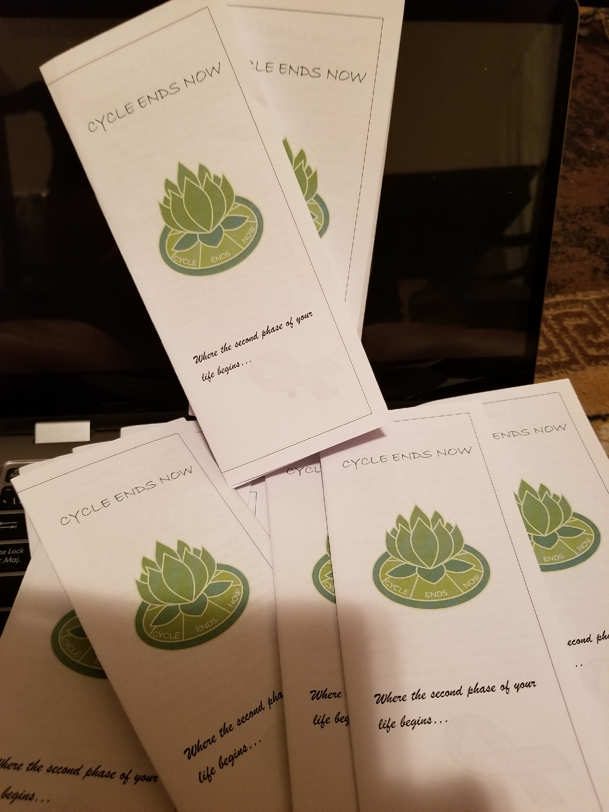
In the end, we got our design put on a brochure for a non-profit organization. Which is a pretty cool thing.